Tonal Logo Tape: How Tone-on-Tone Logo Elastic Elevates Apparel Design[
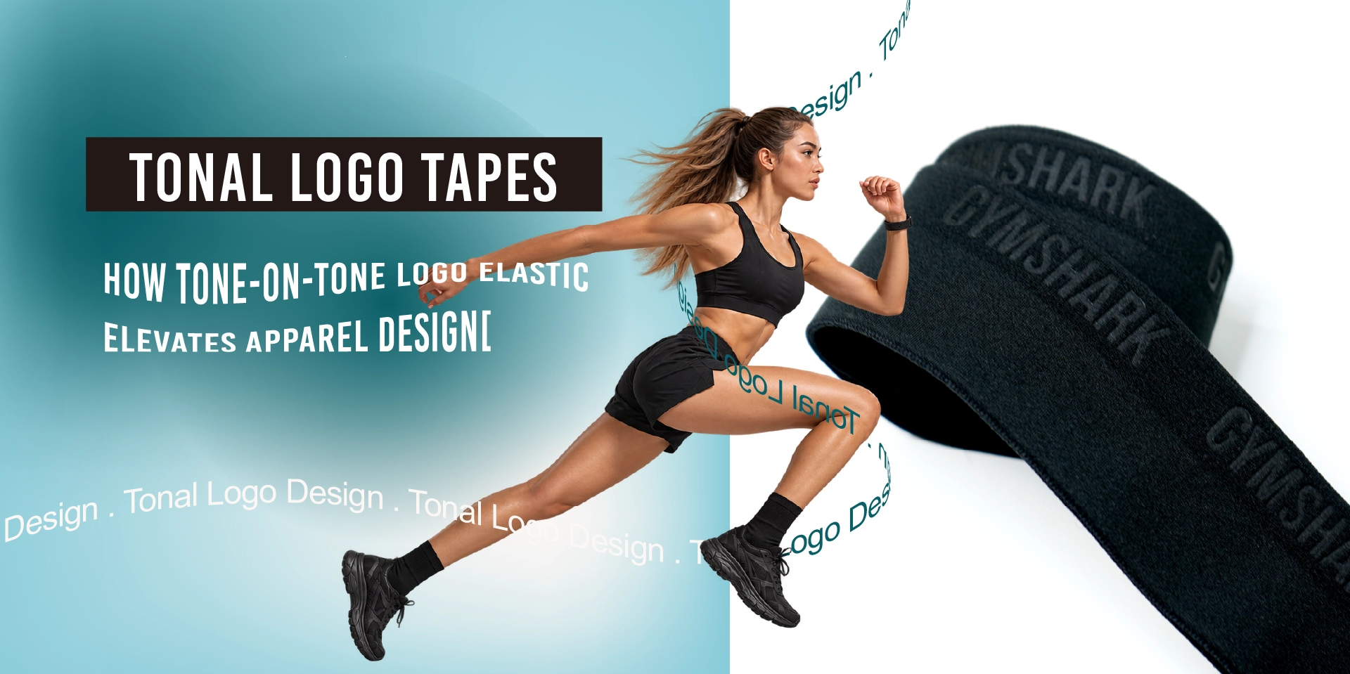
Most brands make a logo bigger and bolder so it gets noticed. On sportswear and close-fitting apparel, though, the most lasting brand identity often sits in the tone-on-tone light and shadow of a waistband: the tonal logo tape, also called tone-on-tone logo elastic.
For brands and product development teams, the goal is not simply to make a logo visible, but to make it work with the garment's silhouette, material properties and wear requirements. This guide covers the key design considerations, the main techniques for making a tonal logo, where tonal logos fit on a garment, and what to specify before development, so designers can turn a concept into a production-ready elastic tape.
What Is Tonal Logo Design?
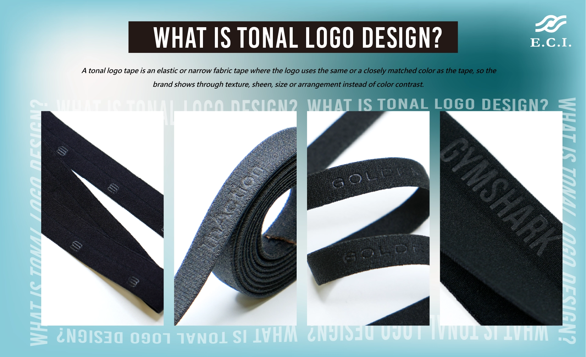
Short answer: A tonal logo tape is an elastic or narrow fabric tape where the logo uses the same or a closely matched color as the tape, so the brand shows through texture, sheen, size or arrangement instead of color contrast.
Tonal logos can be applied to elastic tapes, waistbands, shoulder straps, back-neck tapes and other apparel trims. The overall look stays clean and minimal, while the brand detail becomes clear on closer inspection.
The final appearance depends on product design and material conditions. A logo can be woven into the tape in a matching color, for example, or expressed through surface texture and subtle light-and-shadow effects. For the technical differences between these methods, see Jacquard vs Plain Elastic and Screen Printing vs. Debossing on Athletic Elastic.
The Role of Narrow Fabrics in Brand Identity
Short answer: Once the main fabric, silhouette and colors are set, a branded waistband or trim adds brand coherence without cluttering the garment's lines.
Narrow fabrics are more than functional trims for fastening, support or finishing. They can become part of a garment's design language, and suit clean silhouettes that still need a memorable brand detail. The aim is not to make the logo as prominent as possible, but to have it appear in exactly the right measure.
Four Design Considerations for Tonal Logo Tapes
1. Color: Extend the Garment Palette to the Tape
Start from the colors of the main fabric, stitching, zippers or other trims, then choose a matching color, a close shade or a lighter or darker variation of the same hue. Dark, neutral and low-saturation palettes often suit minimalist designs. If the detail should stand out slightly more, differences in brightness or sheen add depth without resorting to high-contrast colors.
2. Texture: Make the Logo Part of the Material
When color contrast is minimal, texture carries recognition. Weave structure, surface finish and subtle shifts in light and shadow all affect logo clarity. Instead of reproducing a full logo, consider turning its outlines, letters or graphic elements into a visual pattern across the tape. Simplified lines, geometric symbols or repeated motifs often work better on narrow materials than highly detailed artwork.
3. Proportion and Repeat: Build Recognition with Spacing and Rhythm
Logo size, orientation, arrangement and repeat lengths set the visual rhythm of a tape. Logos do not need dense, continuous placement: a single mark, spaced repeats, alternating orientations or localized placement each create a different effect. Compare sizes and repeat lengths first, then review them on the actual garment pattern and physical samples rather than judging from flat artwork alone.
4. Placement: Match Design Intensity to the Garment Area
Each garment area has its own functional demands. Some must withstand repeated stretch and recovery; others prioritize skin comfort or sewing stability. Exposed waistbands and shoulder straps need to stay recognizable during wear and movement, while back-neck tapes lean toward interior detailing and finish quality. The same logo will not suit every location, so proportions and presentation should be adjusted to the application.
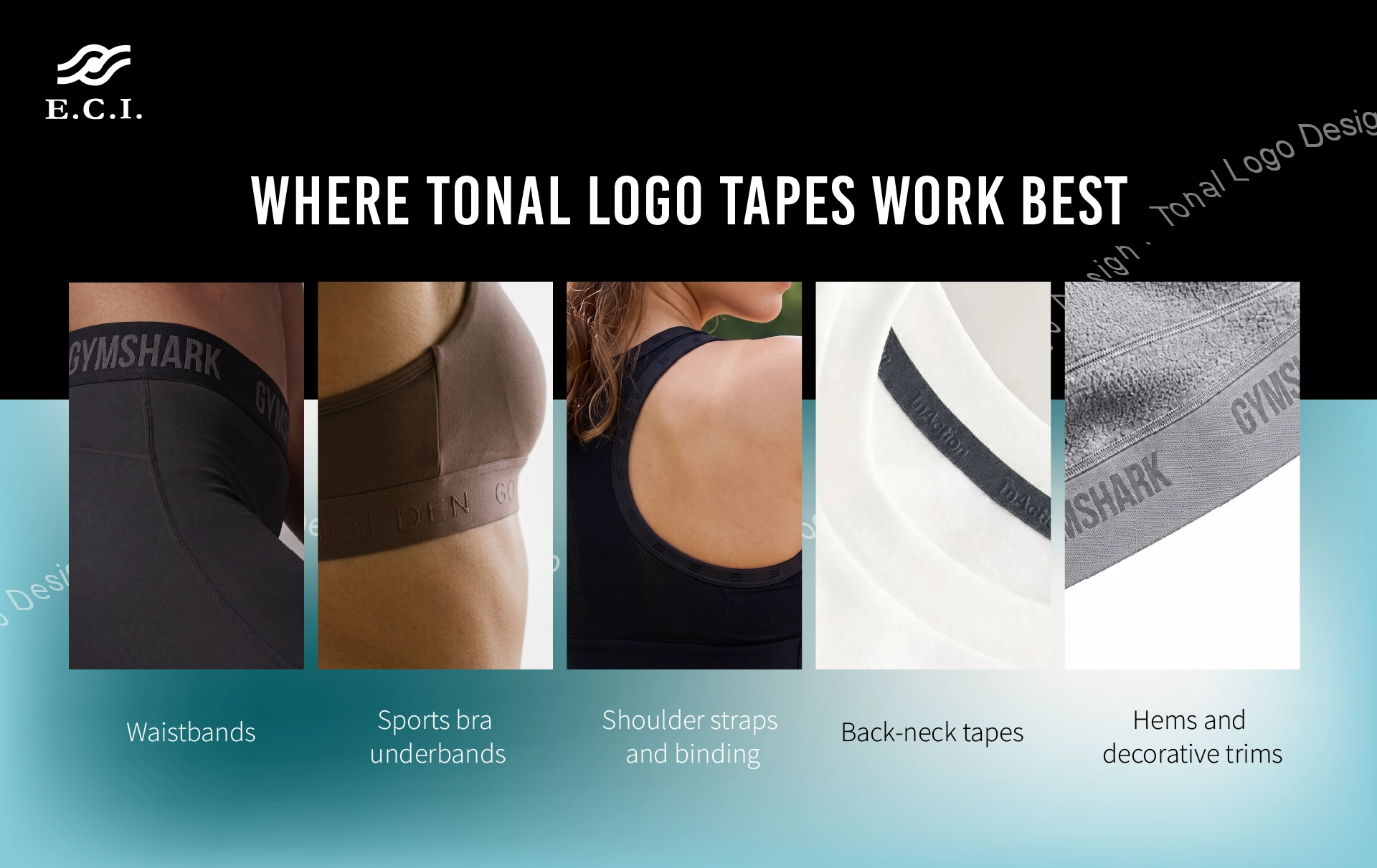
Placement Guide: Where Tonal Logo Tapes Work Best
|
Garment area |
Typical garments |
Design focus |
Effect on the garment and the wearer |
|
Waistbands |
Yoga pants, training shorts, joggers |
Stay recognizable in motion while meeting stretch and recovery needs |
Highly visible area that shapes the first brand impression |
|
Sports bra underbands |
Sports bras, close-fitting tops |
Skin comfort and stable recovery over long wear |
Affects support feel and all-day comfort |
|
Shoulder straps and binding |
Sports bras, tank tops, intimates |
Limited usable width; logo size and repeat must fit the tape |
Keeps garment proportions and function intact |
|
Back-neck tapes |
T-shirts, training tops, casualwear |
Combine brand identity with interior finishing |
Adds a brand detail the wearer notices when dressing |
|
Hems and decorative trims |
Performance tops, jackets, casualwear |
Echo the garment's overall colors and details |
Builds a consistent brand look |
Three Design Directions Worth Exploring
- Quiet Performance: Low-saturation palettes, clean graphics and balanced negative space for a streamlined, performance-led sportswear look.
- Tonal Minimalism: Matching colors and subtle sheen variations that create depth, suited to minimalist apparel, yoga wear, casualwear and premium everyday garments.
- Functional Identity: Logos integrated into functional areas such as waistbands, shoulder straps, hems and back-neck tapes, linking brand identity to garment construction.
These are exploratory design directions, not fixed manufacturing specifications. Final results should be confirmed against brand identity guidelines, tape materials, garment application and physical sample testing.
Application Case Study | Gymshark Sport Hybrid 6" Shorts Waistband
The Gymshark Sport Hybrid 6" Shorts are lightweight, versatile shorts designed for running, weight training and HIIT, with a polyester/elastane stretch shell and an internal drawcord waistband. The waistband has to hold a secure, stable fit through high-intensity movement without relying on thick surface films that compromise comfort against the skin.
ECI developed the waistband with a tone-on-tone embossed logo. On neutral colorways such as Stratus Grey, the raised and recessed texture creates brand recognition through the interplay of light and shadow.

How to Specify Tonal Logo Tapes: A Short Checklist
Six items cover most of what a technical pack needs to state:
- Application and garment type: For example waistband, sports bra underband, shoulder strap or back-neck tape.
- Tape specification: Width, target materials, and required stretch and recovery performance.
- Logo artwork: Dimensions, orientation, arrangement and repeat length. Check that details are not too fine or dense to read when stretched.
- Color and surface effect: Target color range and desired texture or sheen, checked against the main fabric, stitching and other trims.
- Performance requirements: Skin comfort, sewing method, washing conditions and appearance retention.
- Timeline and volume: Expected development schedule and bulk production needs, with time allowed for physical sample approval.
Raising these points early helps design, materials and development teams align sooner and reduces revisions caused by proportion, placement or real-use conditions. Final appearance should be confirmed on physical samples, with stretch, wash and sewing tests as the finished garment requires.
Frequently Asked Questions
Q1. Does subtle logo branding always require embossing?
No. Subtle branding is a design approach, not a single technique. Depending on the material, desired appearance and product application, woven logos or other surface methods may suit better. The technique should follow from both the design objective and the product's functional requirements.
Q2. Are tonal logos hard to recognize?
They can be, which is why color, texture, sheen, logo size and arrangement need to be balanced. Evaluate physical samples under different lighting and at different viewing distances to confirm visibility.
Q3. What apparel suits tonal logo tapes?
Sportswear, yoga wear, intimates, casualwear and other garments that favor a clean, minimal look, especially through a tonal waistband or sports bra underband. Suitability still depends on the tape's function, placement and wearing conditions.
Q4. What matters most when developing a tonal logo tape?
Beyond the logo's appearance, confirm tape width, elasticity, recovery, skin feel, sewing method and appearance after washing. Together these determine whether the design carries reliably into the finished garment.
Q5. What should I prepare before sampling?
Share the garment area, target width and material, stretch and recovery needs, logo artwork and repeat, target colors, and the expected timeline and volume. The more complete the brief, the fewer sampling rounds are usually needed.
Request Samples and Technical Support
Brand recognition often begins with the smallest trim details. ECI Elastic Co., Ltd. specializes in narrow fabric and elastic tape development, with production across Taiwan, Zhuhai and Vietnam, and helps customers evaluate tape solutions for their garment application, material requirements and brand identity.
- Samples: Share your garment area, target width, material requirements and logo artwork, and we can recommend a suitable tape construction and arrange sampling.
- Technical support: Our development team can discuss color, texture, repeat and performance testing in line with your brand guidelines and garment use.
Contact ECI to discuss tonal logo tapes for your next program:
https://www.ecigroup-global.com/en/contact-us.html